A picture is worth a thousand words, so they say. And we couldn’t find a better saying for what our internal communications team applies in their work. They hold the challenging responsibility of breaking down the firm’s strategy into bite-sized information for our 3,700 employees to understand. But how to do that when the information is complex, and our employees’ perspectives are as diverse as they are, with varying degrees of English proficiency? That’s where visual communication comes into play.
Internal Communications? Picture it as a journalist writing about the firm’s ins and outs. Communicating on its strategy, keeping the information flowing, and connecting the dots with what people can see and feel “on the ground”. Beyond delivering messages, the role encompasses making sure people understand and resonate with said information. It isn’t a small matter, but that is where visuals can support conveying and translating messages.
Think cave art. What a brilliant way to record prehistoric history (though we doubt primitive humans consciously did it for this purpose, which is another debate). Think hieroglyphs, a writing system using drawing to represent words, syllables, or letters. Communication was visual before being textual. But why go back to visual communication now that we mastered writing for thousands of years? Why did Florence Nightingale represent the army mortality rate in the Crimean War in what could be one of the first data visualisations? To make information accessible and understandable by everyone, to entice a reaction or an emotion.
In a firm, the ways to display such visuals go from wallpapers to digital or printed signage, presentation slides−the dreaded PowerPoint presentation−, and graphical data and infographics, photos, and videos. All are to be read (or viewed), understood, and considered by the workforce.
Don’t have time to read the whole blog entry? Then watch our “Blog in 1 minute” video for a quick summary of its main points:
A powerful tool for simplifying complex information
The power of visual communication resides in its ability to support breaking complex information into understandable bits. For example, when talking about the company’s strategy, its vision−a statement expressing the firm’s long-term goals−, or safety protocols.
Take the safety card in an aeroplane: It uses comic book-like visuals to explain the safety procedure for sea landing or loss of pressurisation. The same goes for health and safety procedures. You need to use visuals to communicate information easily and quickly on when, where and how to wear safety gear. COVID-19 certainly provided plenty of occasions to develop such aids. Do you believe employees would rather read a manual when they can access the right information on an infographic displayed in every high-traffic area?
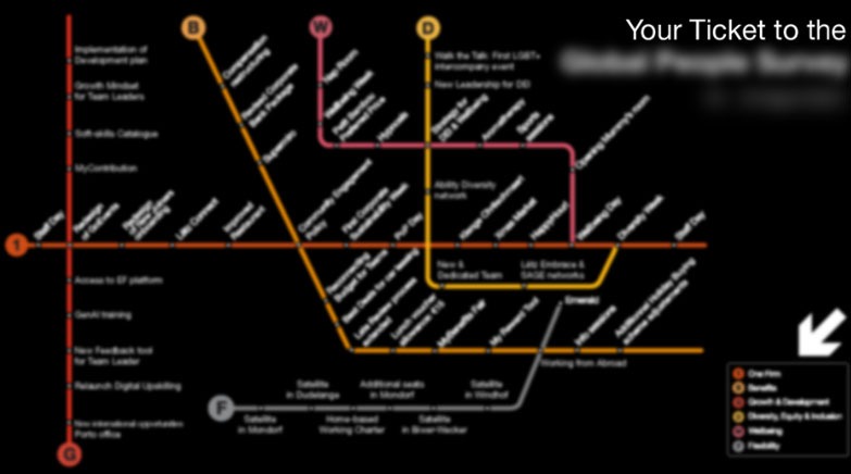
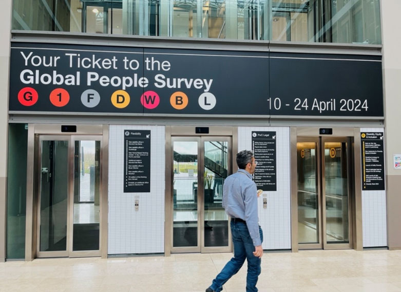
Similarly, you can use infographics to shed light on the company’s strategy by showing the milestones and actions leading to the end goal. For example, using a subway map to transpose the strategy (how we go from A to B), by illustrating where you are and the different stops leading to your destination.


Harnessing visuals for retention and recognition
Research has proven that images play on memory retention. Visual communication can thus help make a message memorable and identifiable. By relying on visual aids, we can ensure people will remember the information shared more easily. But how does it translate concretely?
In internal communications, define and establish a visual identity for critical topics. By using a recognisable iconography and repeating it (as the saying goes in internal communications: ‘repeat, repeat, repeat’), you ensure that people readily connect messages to specific subjects and retain them effectively.
Consider how the company known for its iconic fruit logo−let’s call it Pear−managed to have its symbol become synonymous with user-friendliness and innovation. Using a unique combination of symbols, colours, fonts, and videos, they managed to create a brand visual identity that shouts design excellence—and premium retail price.

Your ally with a diverse workforce
Visual communication can also bridge language barriers, which is an important point when working with a diverse workforce. Take the examples mentioned earlier: safety procedures, aeroplane leaflets, and subway maps often use minimal text and rely on images and diagrams to convey information clearly and concisely, regardless of the reader’s or viewer’s language proficiency.
In internal communications, those visual aids work for a range of messages. Use an infographic to present a change initiative: Why it is necessary for the company and what it’s in it for employees; a selection of well-designed graphs presenting the employee satisfaction survey results. New team members can introduce themselves and describe their function in a video. A diagram is perfect for explaining a new workflow or process, making it easier for employees to understand and follow.
Crafting stories that boost employee engagement
We have established a few arguments showing visuals’ potential in internal communications and how they help grasp complex topics. But the most crucial one is how it can support people engagement: How people feel about their work and their pride and satisfaction with the firm.
Using photos can convey what a thousand words cannot. A picture of joyful colleagues during staff events can draw attention more easily than an email saying that people had a blast. A video of the firm’s CEO explaining the end-of-year results is more engaging and attention-grabbing than delivering the annual report to every employee’s door. A presentation using graphs is more informative than a 15-minute speech on how sales are soaring or plummeting. By using videos, pictures, graphs, and infographics, internal communications professionals can craft messages that evoke emotions and spur specific behaviours.
A miracle solution with “buts”: The complexities of visual communication
Is visual communication the cure for all communication ills or a miracle solution? Certainly not, and moreover, those aids should be used with caution.
While using photos can be a no-brainer, you should consider a few aspects when using infographics or videos. They need to be carefully thought out and reserved for communicating complex or important topics. Like everything in life, it shouldn’t be used for every communication at the risk of over-soliciting people and them tuning you out.
For an impactful infographic, you need to have a great, well-structured copy. Translating the words into a powerful and appealing infographic requires many skills: Knowing how to tell a story, grouping and chunking information in an understandable way−a skill mastered by an information architect−, and translating information into graphics. The same goes for videos: you need to have a concept and a script, filming and editing skills, and people who can convey the right emotions on camera. For data visualisation, also, you need to use the appropriate charts to convey messages effectively.
Speaking of miracle solution, one could think that Generative Artificial Intelligence (GenAI)−which can create new and original content−will democratise and allow anyone to create such visual aids. However, it may also flood us with visuals, and as mentioned above, pose a threat. Authentic visuals and those with a clear added value for employees will likely stand out in this competitive landscape.
In conclusion, one cannot deny that visual communication is a powerful tool in the arsenal of internal communications. It not only helps convey complex information concisely and clearly, but also supports message recognition and memorisation, and bridges language barriers. Above all, visual communication engages people. Research has proven that people process visual information more effectively, and often faster, than text alone. However, like any tool, its effectiveness depends on how well it is used. While it’s not a miracle cure, when used correctly, it can significantly enhance the effectiveness of internal communications. Do you get the picture?
What we think

Périne Weiland, Senior Internal Communications Officer at PwC Luxembourg
Visual Communication is a powerful tool in the arsenal of Internal Communications. It not only helps convey complex information concisely and clearly, but also aids in message recognition and memorisation, and bridges language barriers. Through strong collaboration with our talented graphic designers, we deliver high-quality visuals that ensure these messages are not only effective but also visually appealing, making them more engaging and easier to understand for our diverse workforce.

