When was the first time you heard the word dashboard? Mine was with my parents, in the car, more than a couple of decades ago. And, when was the first time you used it professionally? Around here at least, the usage pattern is growing.
Indeed, dashboard is becoming the type of word that you’re tired of, because the media, your colleagues and social networks are cluttering your semi-full brain with it. I’m a dashboard fan, an honest one, and I want to change this!
This is the story of the first time I had to build a dashboard for the CEO of the company I currently work for. In the beginning I was overwhelmed with the task and the limited space I had to fit all the information in, but I ended up obsessed with how to link charts to tell a visual story where KPIs, all together, made sense to my boss. Among things that I learnt in the process, I remember three in particular: CEOs are very busy people who need digestible information; dashboards are, after all, boards, and they should be on a wall; they have limitations users must be aware of when requesting one.
I prefer to rephrase the start of the paragraph I just wrote. “This is the story of a failed dashboard and how I fixed it with the CEO’s help.”
*Disclaimer: 1) We use the term CEO Dashboard to summarise a set of charts put together to inform and support decision-making. You could call it C-Suite Dashboard if you want to. More than the name, the function it plays is what matters the most. 2) We wrote this story based on real facts.
Why CEOs should fancy a dashboard
Before I tell you my story, I must confess that when I think of dashboard I think of the StarTrek® panel the commander of the USS Starship Enterprise was seeing before striking back interstellar enemies. With that stated and my childhood memories in peace, let’s get into it!
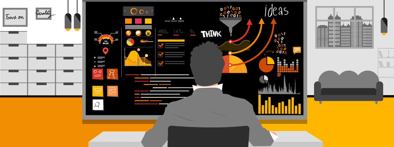
[Keynote 1]
Dashboards offer a quick and high-level view into a business or project. Depending on the purpose, they gather different sets of metrics. Project portfolio, corporate strategy, performance, benchmarking, operations, all of them are types of dashboards. The ultimate goal is help make faster decisions to answer business-related matters.
When I first entered his office, the CEO asked me to sit down, offered me a glass of water and, looking at his king-sized computer screen, he told me: “I want to get this dashboard right, son. Could you briefly explain to me where I should start?”
He had seen the dashboard that I created the previous quarter only twice, and our meeting was the second. I felt disappointed.
I’m the kind of person who criticises (when necessary) and fights bad design. Precisely a couple of days before the meeting with the CEO I had said to a bank officer on the phone, “Do you actually design these forms with the user in mind or working with them?” If so, why didn’t I reach out to the CEO, the future user, before kicking off the dashboard creation? Not practicing what you preach isn’t only inconsistent, it’s a trouble maker…and a problem booster too!
[Keynote 2]
For a dashboard to be truly useful, aim at making it a day-to-day tool, like reading the news on your wall. Ideally, it should become an enabler, an opportunity to discuss strategic aspects of the business.
I wanted to clean up the data chaos the CEO’s eyes see passing through daily and offer a snapshot of the reality, but my distillation exercise was ambitious, misinformed, went too far and ended up looking like 55 Cancri e, the densest planet yet found out of our solar system (Yes, I love planets too though I’m not a scientologist!)
For Crancri’s sake, who could digest all those charts?, I thought. Even I wasn’t capable of explaining what I wanted to represent.
[Keynote 3]
Dashboards are an opportunity to distil large data volumes, and narrow down the information to formats that are easier to interpret. It’s a way to democratise information, because visual representation requires less technical skills and help users optimise time.
Plan the CEO Dashboard wisely; therefore, it will exist
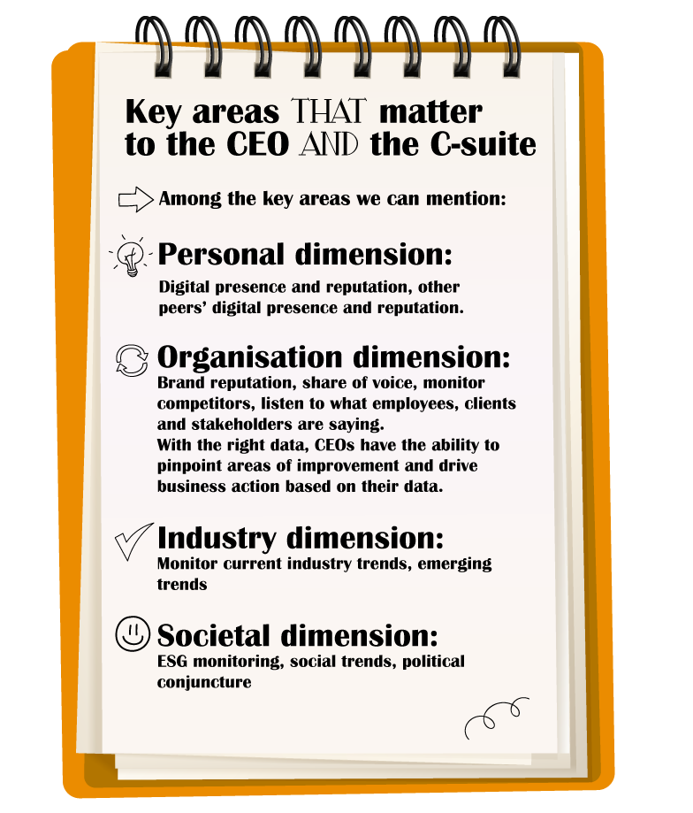
Did you pay attention to my notes above in the notebook? In fact, to create my first CEO dashboard I dug into the data visualisation training I took two years ago. Those were examples of key areas in which CEOs, the C-suite or any other decision maker are likely interested.
“When everything is important, nothing is important,” an experienced colleague used to say at my first job.
“When everything is important…” “Why didn’t I recall this life lesson when creating the CEO dashboard that I’m trying to explain now,” I wondered looking at the CEO’s computer. “Now I’m here, sipping my coffee nervously, embarrassed, and still in my six-month probation period.” Did you know that dashboard users pay more attention to the information a dashboard displays depending on where you place it? Honestly, I had some idea about this, but I never boiled it down, and I likely missed that class because my notes didn’t tell me anything about.
Back in the office, after the CEO told me “Son, I’ve got another meeting, we talk afterwards”, I jumped into my search engine and I started seeking information on dashboard design. After some browsing, I found this simple yet useful framework:
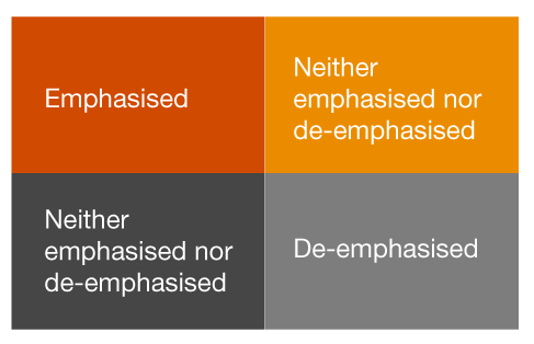
The 4-quadrant figure above indicates what areas human eyes pay more attention to when deciphering a dashboard or any similar visual representation.
The Key Performance Indicators (KPI) you want to emphasise go on the lower left hand, right? Wrong! Where would you place them, then?
The appeal of charts: Why a CEO Dashboard must be sexy
Like most things in life, humans fancy artifacts that are easy to use and visually pleasant. We like beauty that is effective and makes our present and future lives a better version of what we were before.
How to make the CEO’s life better, I wondered. Inspired and after the lesson learnt, I wrote down my roadmap.
[Keynote 4]
The right design will make your dashboard the decision-making tool that CEOs or any interested users need. Bad design downgrades their value. They must be clarifying, not confusing. Less is more in data visualisation.
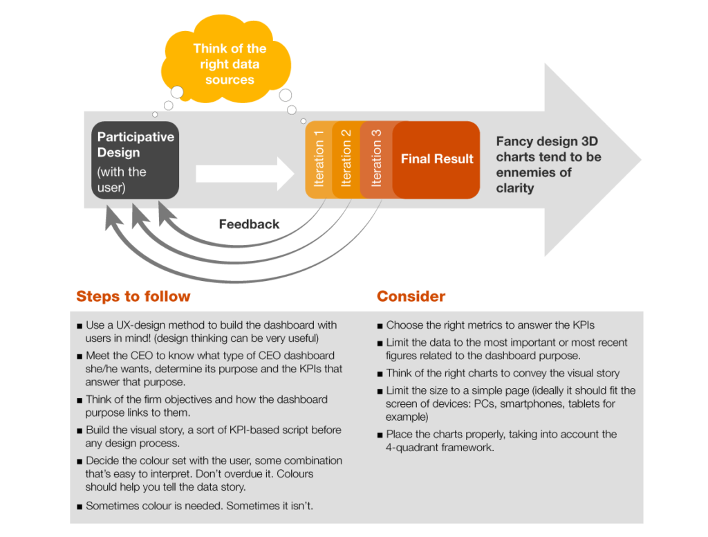
My roadmap to a CEO Dashboard
See, son, “I want to sit down right here every morning and see the world of data I’m interested in on that wall,” the CEO said to me the embarrassment day, before leaving for his next meeting.
I translated that sentence into:
– He doesn’t want to scroll down to search for data.
– I didn’t really know the world in which he’s interested.
– Designing the CEO dashboard cannot be a lonely exercise.
– The dashboard needed to be something sexy enough he wanted to look at every working day.
With these cool hints, I outlined my roadmap:
CEO Dashboards and what my grandma told me
When I first joined the university, I didn’t bet on business studies. I was in love with words, but my writing career ended up abruptly a rainy Wednesday night.
I remember running a red light, so excited was I, to tell my grandmother I had finished my first book, a series of five stories, somehow connected. She had been my heroic storyteller in the years when streaming services weren’t even an idea, and the only twitter I knew was coming from my backyard’s imprisoned sparrow.
She said to me: “my eyes are tired tonight”. “Would you summarise in a couple of minutes what it’s about?” I got tangled up with my words and I finally couldn’t. So I quit.
Now I’m back, waiting for the CEO to arrive. A month went by very quickly since our first meeting. In the meantime, I did my job, I followed the roadmap, and I came up with a new dashboard, well, with two of them indeed.
In the weeks that followed, he and I had a couple of short but insightful discussions. He really wanted two products: a benchmarking dashboard and a portfolio dashboard. With the first he could monitor performance indicators and compare them with the competitors. With the second one, he could monitor multiple strategic projects at once.
Before entering his office to present the dashboards built with a user-centric mindset, I asked myself: will he understand the dashboard right away or will he ask me to explain it to him in a couple of minutes as my grandma did? Both options are good to me but the KPI-based visual story needs to be good and consistent enough for me to explain it in 2 minutes. I’ve got my fingers crossed. Do that for me too.
What we think
Benedikt Jonas, Director at PwC Luxembourg
“Make it simple, personal and visible! A great place for a CEO Dashboard to become a useful tool is the CEO’s office wall, telling the visual story with real-time data. The data, naturally, have to answer CEO’s information needs, ranging from internal topics to clients and markets. Finally, adding any life-style information that’s in the CEO’s personal interest, e.g. sports, music, travel… will help transform a corporate dashboard into a daily working tool.”